Will Landscape Mural Wallpaper Make My Room Look Bigger? Size Impact Guide
Introduction
Are you feeling that your space is a bit cramped and wonder if a landscape mural wallpaper will make it feel bigger? As a wallpaper designer, this is something I spend hours working on, experimenting with visual room enlargement techniques.
In this guide, I’ll share with you the insider secrets of how a landscape feature wall can revolutionize your room’s appearance.
How Do Landscape Murals Create Depth In A Room?
You know that moment when you step into a room and suddenly feel like you can breathe deeper?
The psychology behind how human eyes process depth and perspective in interior spaces
Let’s dig into why this works, because understanding the science behind it has completely changed how I approach mural design.
Our brains are actually hardwired to process depth cues – it’s a survival thing that dates back to our ancestors.
When we look at a landscape mural, our visual cortex processes these depth cues just like it would if we were standing in nature. Pretty cool, right?
Impact of perspective and vanishing points
Here’s what I’ve learned while studying countless landscapes: the key lies in something called linear perspective. Objects near you seem bigger and, the more distant they are from you, the smaller they seem.
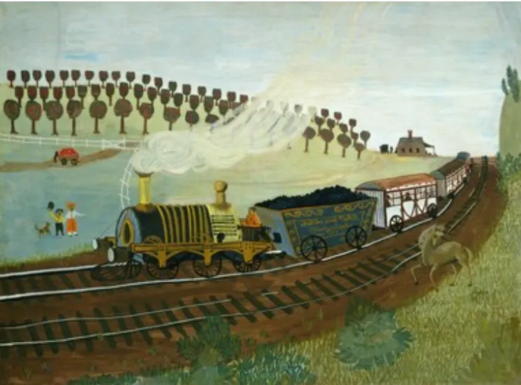
Think about when you’re looking down a long road – how everything seems to converge at a distant point. For example, in this painting the railroad, the orchard tree lanes, and footpaths all meet in a distant point on the right, can you see? That’s your vanishing point, and it’s pure magic for creating depth! In my designs, I carefully position these vanishing points slightly above eye level, which research shows is the sweet spot for making a room feel larger.
One mistake I made in the past, I tried to make everything centered and symmetrical – I hoped that would help achieve balance. But that’s not how we are wired. Our eye is designed to wander, and the more a mural invites you to do it, the more interesting and attractive it becomes.
What Design Elements In Murals Maximize Space?
We’ve spoken about mural design psychology, and how your eye is tricked into believing it sees more space.
Well, painters have used these techniques on plain 2D surfaces for centuries, and they still work today.
Here I’ll show you a few examples of how these tricks work in a few successful landscapes.
How foreground, middle ground and background elements create depth
First off, we have to speak about three art terms, but they will help you evaluate any mural wallpaper like a pro.
The most successful murals are the ones that imitate nature. On your next walk where you can see far in the distance, pause and take a look at what your eye actually sees:
- Strong foreground elements (like detailed trees or rocks closest to you) to establish depth
- A clear middle ground with slightly reduced detail – where trees and bushes seem to morph into a large shape.
- A misty, softer background that seems to fade into infinity – and usually it has those faint blue or grayish tones, depending on the weather.
And since we’ve “trained our eye” to perceive depth that way, well guess what? – when an artist paints using the same principles, your eye is tricked to see depth where in reality it’s just a flat surface. This is where the magic really happens.
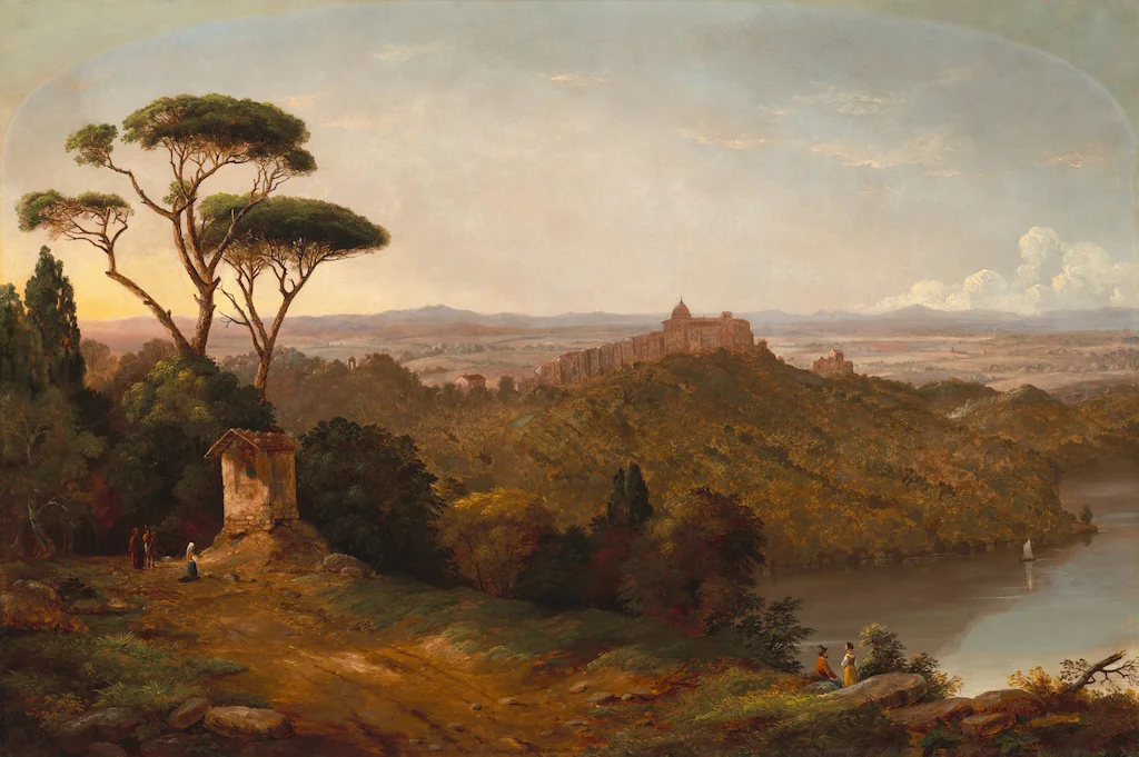
Remember though that the magic doesn’t just happen with any landscape mural. The key is choosing one that thoughtfully incorporates these depth-creating elements.
When I’m designing murals, I always ensure there’s a clear progression from foreground to background, with carefully planned perspective lines that guide the eye naturally through the scene.
One helpful trick I’ve discovered is using what I call “transitional elements” – things like trailing vines, winding paths or flowing water that help guide the eye from one depth plane to another. These elements create a more natural flow and enhance the perception of depth.
Also, I’ve found that the most successful space-maximizing murals actually simplify as they recede. Look at this famous mural – the flowers in the foreground are detailed and in full color, and the ones in the middle ground are only faded silhouettes with the background just being plain color. Just like that old saying “less is more” but applied specifically to depth perception. This gradual simplification naturally draws the eye deeper into the scene, making your room feel much larger than it actually is.
And now that you know how these three interplay, it’s time to talk about something that keeps me fascinated:
Atmospheric perspective tricks your eye into seeing more space
This is where things get really interesting. You’ve probably noticed how distant hills appear bluer and less detailed than closer ones.
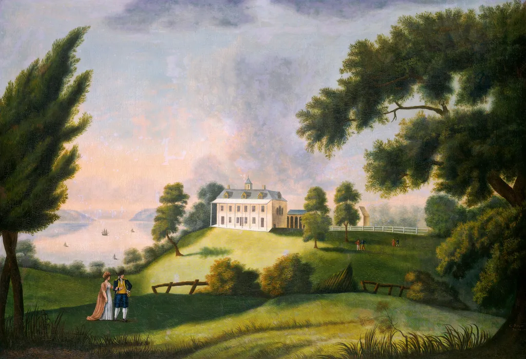
How this natural phenomenon, called atmospheric perspective (or aerial view), works in murals still amazes me every time.
You can see in this example that the forest-covered hills in the foreground are warm green and they turn bluer, ridge by ridge, into the background.
It is something I absolutely love incorporating into my own mural designs too. I start with more contrast and warmer tones in the foreground, then gradually reduce contrast and transition towards cooler tones in the background.
This mimics how our eyes perceive distance in the real world and can create an incredible sense of depth.
Importance of horizon line in your mural
The horizon line in your mural is like an orchestra conductor – it directs all players to move in harmony.
I’ve found that positioning the horizon line slightly above the eye level creates that natural and expansive feeling in most rooms – that’s how we’re hardwired to respond to depth in nature.
Moving the horizon line in your mural can dramatically impact the feeling of space. Place it too high, and it creates an unsettling sensation, because it makes you feel smaller.
I must say though, I like when it is sometimes at a lower level, especially when the sky blends with the surface around the horizon line. I love that for a room with a low ceiling. A lower horizon lets in more of the sky and draws your eye upward.
And that’s why seascapes are great for that. Your eye keeps wandering up and down, down and up and as the sky blends into the water, that creates an illusion of infinity.
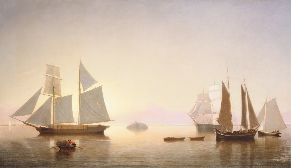
If you prefer large scale murals without a horizon line, make sure there are vertical lines that will draw your eye upwards. For example, in a forest scene – when the trees are shown as if you’re looking up and the treetops disappear somewhere high in the sky, it can also create an illusion of height. Especially, if you continue with a cloud-filled mural on the ceiling or match your ceiling paint with the color in the background around the treetops.
So if you’d like to add extra space visually, look for landscapes with panoramic views, depth: foreground, middle ground and background – where you can see the light changing from warm to cooler hues and objects getting smaller and smaller the farther they move into the background.
Remember, though, that these aren’t rigid rules – they’re more like guidelines that can be adjusted based on your specific space. The key is understanding how each element contributes to the overall perception of depth in your own room.
Choosing Your Perfect Landscape Mural Wallpaper
Room expansion ideas: what to look for in a landscape mural
When we’re talking about wall murals for maximizing space, it’s not so much about which images you’ll choose, but it’s more about these:
Light:
- Is it dark and moody, bold and dramatic, or light and airy?
- Does the light change and create an optical illusion of depth?
If it’s dark and moody it can actually create a feeling of vanishing corners (when white paint brings out each and every corner in the room).
Composition:
- How do different elements interact with each other?
- How close or how far they’re from each other?
- What is their scale?
So, let’s give them a better look.
How to assess your room’s light conditions for scenic wallpaper selection
Remember that natural light is your best friend when it comes to maximizing your mural’s depth effect.
Stand in your room at three different times of day – morning, afternoon, and evening. Take photos each time, and look at how the shadows fall.
This will help you understand your room’s natural light pattern. If you notice harsh shadows at certain times, you might want to avoid murals with high contrast elements in those areas.
Rooms that face west or south may have harsh shadows – “light paths” in your room – clear routes where natural light can travel across the room.
For north-facing rooms that don’t get much natural light, I’ve found that murals with warmer undertones work wonders. Think golden hour mountain scenes or sun-dappled forests.
Also, the same color hue can look dramatically different depending on your climate zone.
That’s why in the United Kingdom they love warm yellows and greens, deep reds and those hues look amazing – because they don’t get much warm sunshine.
And in the south of France, where there’s plenty of bright light, they opt for cooler blues, greens and lavenders.
In fact, the surfaces are so beaten by direct sunlight that these colors fade very quickly, hence the name of ‘French blue’.
And here’s something most people don’t consider: seasonal lighting changes. My advice is to observe how your room’s lighting shifts throughout the year. For example, I’ve noticed that my living room in winter actually gets more sunshine (surprisingly!) Because the sun’s lower in winter, its angle changes, more light pours into my living room. Which means, I can go with landscapes in cool colors, as in summer cool is what I want, and in winter this light will warm them up.
If that’s not the case in your home, a mural that looks perfect in summer might need additional lighting support during darker winter months to maintain its space-enhancing effect.
Also, avoid walls that get direct sunlight for extended periods (it can fade your mural).
Which landscape scenes are most effective for room size enhancement – mountains, forests, or seascapes?
A lot of articles on the internet will advise you that a different nature scene will create a different perception of space. I actually don’t see that to be entirely true.
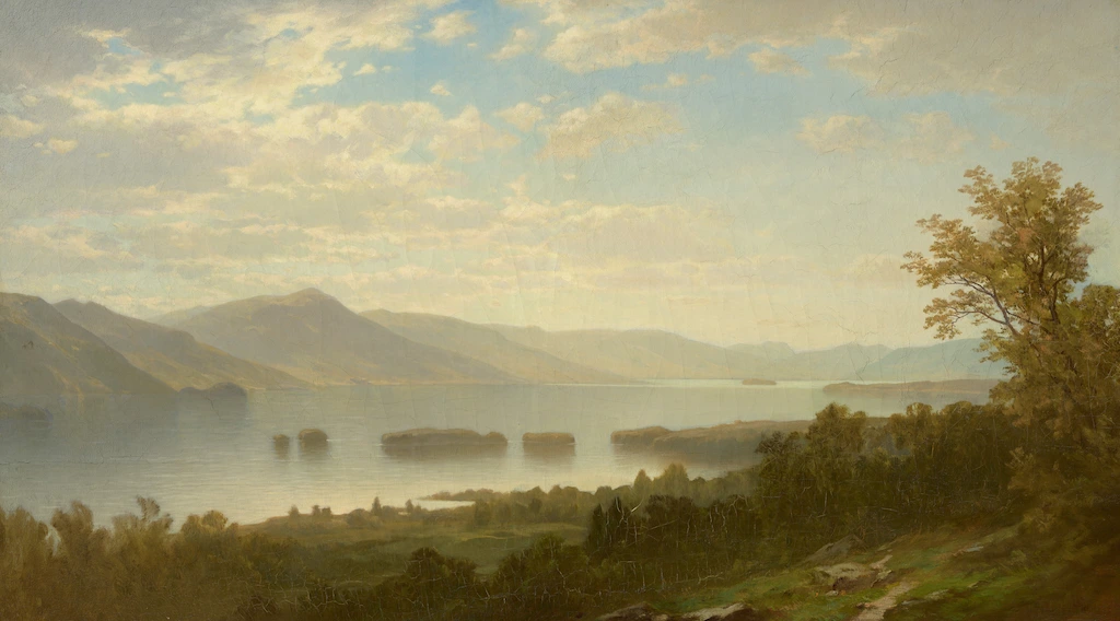
Scenes are extremely important for one reason: how they make you feel, because your home is a mirror of your personality.
So, if we’re talking which one – forest, mountains or a seascape- my question to you is: which one do you want to wake up to?
Choose the scene that makes you most happy.
Having said that, some of these scenes do tend to create a feeling of large expanse because of their composition and scale.
Let’s talk about that.
Mural scale guidelines: How scale affects room size perception
Usually landscapes with large scale elements in a smaller room will create a cocooning effect – but not make it bigger. Let’s say you have a dense jungle scene with large foliage.
If the elements in the landscape are large scale and densely placed, with layers on layers, it may sort of envelope a room.
If that’s what you’re after, go for it – wouldn’t it be great to wake up to all that in your bedroom?
But here we’re talking about rooms that need a subtle expansion effect.
So, if you’re into forest scenes, you’ll want to avoid murals with large, dominant foreground elements. They can overwhelm the space and actually make it feel smaller. Instead, opt for designs where the main focal points are in the middle distance.
Other murals that naturally break into foreground, middle ground and background are mountain scenes.
Especially mountain vista murals with peaks receding into the distance, tend to create the most dramatic sense of depth.
I absolutely love these for rooms with lower ceilings – there’s something about those vertical elements that draws the eye upward and outward simultaneously.
However, if your room is already on the narrow side, you might want to think twice about mountains, as that vertical movement can make a space feel a bit enclosed.
Seascapes are brilliant for rooms that feel a bit cramped.
That endless horizon line where the water meets the sky naturally makes the room feel wider, which does wonders for spatial expansion.
Seascapes can be dreamy and work great in a bedroom, in a nursery and the ones with more dramatic bold colors, moodier hues will be perfect for a library or an office.
One mistake I made earlier about scale was not considering the viewing distance. I once installed a garden scene in my bedroom on the facing wall, and even though the roses were breathtaking it felt like they were about to jump out of the scene on my bed!
Remember, you need to be able to step back at least 6-8 feet from your mural to get the full depth effect. If your room doesn’t allow for this, consider a design with a gentler perspective and elements at a smaller scale.
And the best for the last:
Always test.
Testing your mural selection is crucial.
Get samples, see how they’ll look in your space.
You can also use digital visualization tools but they won’t help you to see what it will look like in your light conditions. View your samples both during daylight hours and at night with your room’s artificial lighting – you might be surprised at how differently the same mural can appear!
Strategic Placement for Maximum Impact
Mural is an investment and you want to maximize it. So, you might think that the longest uninterrupted wall is the answer, but I’ve learned that it’s not always true.
Best walls for mural placement to enhance room size
A great place for your mural would be on the wall that your eyes are naturally drawn to when you enter the room.
Even better, if you can see that wall from the adjacent room , it can create visual interest and serve as an invitation.
Like in this interior by xyz the mural draws us into the dining room
In most cases, this is the wall directly opposite the entrance, but if you have a narrow wall, for example, a landscape mural could solve the problem thanks to visual space expansion.
What if your room has multiple doors and windows?
You can turn those architectural features into assets!
Here’s my guide for working with different architectural features:
- Windows:
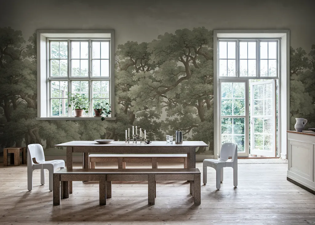
You can extend the view from your windows by placing a similar scenery wallpaper. Consider what views you have from your windows – adding more of the same can create this uninterrupted effect and almost dissolve your wall into your landscape outside. In this photo from Rebel Walls a mural with dense forest foliage continues the views from the windows looking out into the woods. Position horizon lines on the same level, and you’ll create an illusion of an uninterrupted view.
- Doors:
Use vertical landscape elements (like trees or cliffs) to frame doorways. - Alcoves:
Treat them as natural frames for focal points in your mural. Or, you can place a mural only in the alcove and create a cozy escapist nook. - Sloped ceilings:
Align any diagonal landscape elements with the ceiling angle
Furniture placement tips to complement your mural
Now, let’s talk about furniture placement, because this can make or break your mural’s impact. One mistake I see (and yes, I’ve made it myself!) is pushing all the furniture against the mural wall. However, you don’t want that gorgeous mountain peak completely obscured by a bookcase, right?
This completely defeats the purpose of creating depth!
So it’s a good idea to map out furniture placement before finalizing the mural design.
To enhance room space thanks to the mural’s visual effect, pull furniture slightly away from the mural wall. Even just 12-18 inches can create this amazing sense of the landscape continuing behind your furniture.
Even better, to create more spaciousness, try this approach:
- Place lower furniture pieces (under 30 inches) near the mural wall;
- Gradually increase height as you move away from the mural
- Position tall pieces at least 24 inches from the edges of your main mural focal points
- If you have a console table against the mural wall, keep it under 36 inches in height to maintain the depth effect
- Use glass or lucite pieces near the mural to maintain visibility
One surprisingly effective trick I’ve discovered is using mirrors strategically with your mural. Place a mirror on the adjacent wall or position several small mirrors at angles that catch glimpses of your landscape mural. It creates this wonderful sense of the scene wrapping around your room.
Other Design Strategies for maximum Space-Creating Effect
What’s the point of installing an enchanting vista when it ends up getting crowded by furniture or your furnishings compete with your mural?
Let’s start by learning from this example of a magical room by Fawn Galli and then I’ll share some valuable lessons I’ve learned about how every element in a room either enhances or fights against your mural’s space-creating effect.
Coordinate room colors with your landscape mural
Color coordination is absolutely crucial, but it’s not about matching everything perfectly. Look at this picture. The show stopper is this lush green forest mural and all other elements serve as supporting cast.
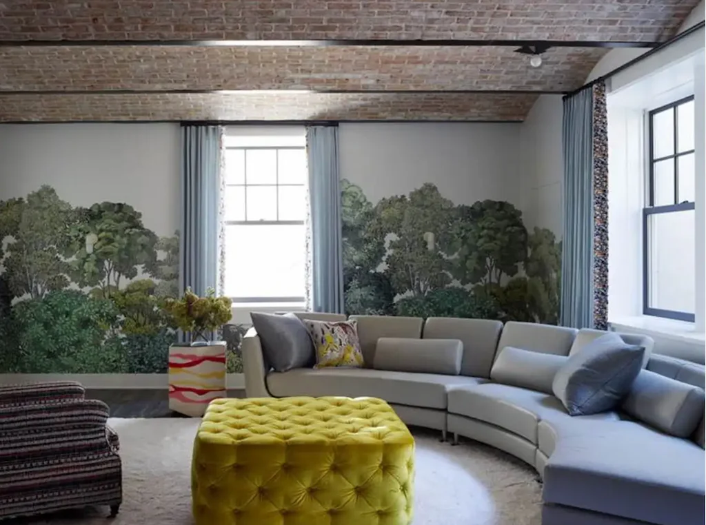
Keep furnishings and furniture nearest to your mural in neutral tones from the background, so they don’t compete.
Just like the soft grayish blue of the sky in the mural background creates space for the lush forest and that airy feel, so the curtains mimic the sky in a more distinct blue. Even a massive couch seems as though it vanishes.
These colors work brilliantly for larger items like sofas or rugs because they serve as a bridge and connect the scenery with the room, as if the scenery is stepping into your living space.
Pick out a few elements in the middle ground and echo them in a few elements in your room decor.
In this case, it’s the flower arrangement that picks out warm hues from the mural. Again, it tricks our eye into feeling as though the trees from the mural step into the room, making the scene three-dimensional.
You can also choose a couple of colors from the middleground for your main furniture pieces, like the chartreuse ottoman. I call this “echo hues” – colors that appear in the background or middle distance of your landscape scene.
One other trick that works like charm, is when you select one background color from the mural for your ceiling (it creates that high sky effect).
Pick a complementary color for small accents like cushions or artwork
The mural in the photo is mostly shades of green, so orange and red accents on a side table and a cushion print are small, but the contrast makes them sing.
In the same way, if the most dominant color in your mural is blue – introduce some yellow, orange or gold accents.
Soft furnishings pairings that maximize the effect
Let’s dive into textiles because they play such a crucial role in enhancing your mural’s impact. I’ve found that using textiles in different weights and texture can create this beautiful layered effect that mirrors the depth in your mural.
Here’s my specific guide for textile selection:
- Use lighter, airier fabrics near the mural wall
- Choose heavier textures for furniture further from the mural
- Keep patterns smaller on items closer to the mural – use contrasting patterns as accents, but don’t let them compete with your mural
- Incorporate one or two textural elements that mirror textures in your landscape. For example, if you have a forest scene, pick a couple of pillows or upholster a chair that will be echoing the tree foliage.
When you’re making an investment in your landscape mural, you want it to be the star of the show, with all other elements in the room being a supporting cast. Otherwise, what’s the point, right?
Conclusion
So, a landscape mural wallpaper won’t add square footage to your room, but it will make you feel that your room is bigger.
We saw how different design elements like perspective, color, and scale can trick your eye into seeing more space. That’s why in my designs I always pay special attention to a careful combination of these elements.
You can create an even more expansive feeling in the room by paying attention to the natural light in your living space and strategically placing other pieces, like furniture and lights.
I know, it’s a lot to think about, so download my helpful guide (with a checklist) here.
Go ahead, and take advantage of the secrets I’m sharing in this guide to help you make a choice, which landscape wallpaper to install in your home.

